Use this panel to configure common web page settings shared by both the Assessment and Remediation, as well as the Registration portal web pages.
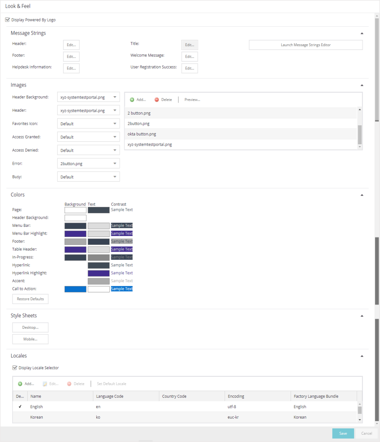
- Display Powered by Logo
- Select this check box to display the Extreme Networks logo at the bottom of all of your portal web pages.
Message Strings
Select the Editor button to configure each of the fields:
- Header
- Use to configure the link for the header image displayed at the top of all portal web pages. By default, the header image is configured as the Extreme Networks logo acting as a link to the Extreme Networks website. Text entered in this window can be formatted in HTML.
- Footer
- Use to configure the footer displayed at the bottom of all portal web pages. By default, the footer is configured with generalized information concerning an organization. Change the example text in this section to customize the footer to your own organization. Text entered in this window can be formatted in HTML.
- Helpdesk Information
- Use to configure the Helpdesk contact
information provided to end users in various scenarios during
the assessment/remediation and registration process (e.g. an end-system
exceeded the maximum number of remediation attempts).
By default, this section is configured with generalized Helpdesk information, such as contact URL, email address, and phone number. Change the example text to customize the Helpdesk information for your own organization.
Text entered in this window can be formatted in HTML. In addition, the entire contents of the Helpdesk Information section are stored in the variable "HELPDESK_INFO". By entering "HELPDESK_INFO" (without the quotation marks) in any section that accepts HTML in the Common Page Settings (or any other settings), all information configured in this section will be displayed in place of "HELPDESK_INFO".
- Title
- Use to modify the text that appears in the title bar of the registration and web access page browser tabs. The default page title is "Enterprise Registration."
- Welcome Message
- Use to modify the message displayed to users on the menu bar of any registration or web access page. The default welcome message is "Welcome to the Enterprise Network's Registration Center."
- User Registration Success
- Use to edit the message displayed to users after successfully registering their end-system to the network.
- Launch Message Strings Editor
- Select to open the Message Strings Editor, where you can modify the message strings that display on any registration or web access page.
Images
Using the drop-down menus, you can specify the image files used in the
portal web pages. All
image files used for Assessment and Remediation and Registration portal web pages must be
defined in this list. The image
files defined here are sent to the ExtremeControlengine along with the
web page configuration. Use the Add button (in the field to the right) to select an image file to add to the list. You can select an image
in the list and use the Preview button (in the field to the right) to preview the image.
Once an image file is defined, it is available
for selection from the configuration drop-down lists (for example,
when you configure the Access Granted), and may be referenced in the sections
supporting HTML. Available drop-down lists include:
-
- Header Background
- Select the background image displayed behind the header image at the top of all portal web pages. The drop-down list displays all the images defined in the Images window for your selection. To add a new image, select Add to open the Images window.
- Header
- Select the image displayed
at the top of all portal web pages. The drop-down list displays all
the images defined in the Images window for
your selection. To add a new image, select Add to open the Images window.
- Favorites Icon
- Select the image displayed as the Favorites icon in the web browser tabs. The drop-down list displays all the images defined in the Images window for your selection. To add a new image, select Add to open the Images window.
- Access Granted
- Select the image displayed when the end user is granted access to the network either based on compliance with the network security policy or upon successful registration to the network. The drop-down list displays all the images defined in the Images window for your selection. To add a new image, select Add to open the Images window.
- Access Denied
- Select the image you would like displayed when the end user has been denied access to the network. The drop-down selection list displays all the images defined in the Images window for your selection. To add a new image, select Manage Images to open the Images window.
Colors
Select the Background or Text color box corresponding to each item to open the Choose Color window, displayed below, where you can define the colors used in the portal web pages:
-
- Page — Define the background color and the color of all primary text on the web pages.
- Header Background Color — Define the background color displayed behind the header image.
- Menu Bar — Define the background color and text color for the menu bar.
- Menu Bar Highlight — Define the background color and text color used for the menu bar highlights in the Administration pages.
- Footer — Define the background color and text color for the footer.
- Table Header — Define the background color and text color for the table column headers in the Administrative web pages.
- In-Progress — Define the background color and text color for task in-progress images.
- Hyperlink — Define the color used for hyperlinks on the web pages.
- Hyperlink Highlight — Define the color of a hyperlink when it is highlighted.
- Accent — Define the color used for accents on various parts of the web pages.
Select OK to save the changes.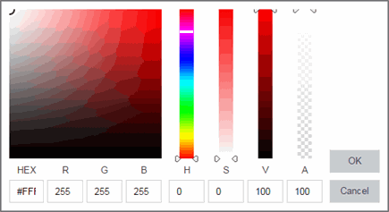
Style Sheets
Select the Desktop or Mobile buttons to open the Edit Style Sheet window where you can create a style sheet that adds to or overwrites the formatting styles for the portal, or mobile version of the portal web pages, respectively.
Locales
This field lists the locales (languages) presented as options to the user in the captive portal, in addition to the default locale.
- Display Locale Selector
- Select this check box if you want a locale (language) selector to display as a drop-down list in the menu bar on the captive portal welcome and login pages. This is useful for a shared machine where the users of the machine may speak different languages. (On the mobile captive portal, the selector is displayed as a list of links at the bottom of the welcome screen.)
For information on related help topics: