Use the Impact Analysis Dashboard to view a real-time summary of Availability, Performance, Capacity/Health, Configuration, and Quality data for your network. To access the Impact Analysis Dashboard, navigate to the Network tab and select the Dashboard tab.
Select the report button ( ) to open the Impact Analysis Report page window in the Reports Designer tab.
Charts
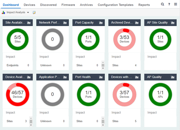
The dashboard provides you with ring charts and data that identify the scope and scale of faulting elements in the network or site. Charts display a name and impact status for a particular factor, and are updated automatically when conditions change.
| NOTES: |
A network element is considered “faulting” if it is non-optimal relative to a certain factor; for example, a device that has not been archived recently or an application that is responding poorly. A network element is considered “impacted” if it has a relationship to a faulting element which might affect its operation; for example, an endpoint connected to a device that failed. |
The center of each chart contains a ratio of the non-faulting elements compared to the total number of elements. Hover over a ring color to display a complete description of the ratio. ExtremeCloud IQ Site Engine uses these ratios, converts them to a percentage, and uses them to determine the impact status. Below each chart is an Impact Summary, which displays the network elements impacted by any faulting elements.
The Impact Status is reflected by color:
| Impact Status | Color | Description |
|---|---|---|
| Low |

|
None, or few, faulting elements |
| Medium |

|
Some, but not many, faulting elements |
| High |

|
Many faulting elements |
The thresholds that determine the Impact Status (Low, Medium, or High) for each chart is configurable in the Impact Analysis options on the Administration tab.
When the Impact Status changes for network elements (e.g. device availability changes from Low to Medium or from Medium to High), an event is generated and is available in the event log on the Events tab.
- Site Availability
-
The center of the Site Availability ring chart indicates the ratio of sites with which ExtremeCloud IQ Site Engine can communicate to the total number of sites with at least one device. The number of end-points impacted by sites ExtremeCloud IQ Site Engine can not reach is listed in the Impact Summary beneath the ring chart.
- Select the ring chart to open the Unavailable Sites report that displays sites ExtremeCloud IQ Site Engine can not reach.
- Select Endpoints in the Impact Summary beneath the ring chart to open the Endpoints Impacted by Unavailable Sites report that provides more details about endpoints with devices.
- Select the report button (
 ) to open the Site Availability History report that provides a historical view of the Site Availability chart.
- Select the ring chart to open the Unavailable Sites report that displays sites ExtremeCloud IQ Site Engine can not reach.
- Device Availability
- The center of the Device Availability ring chart indicates the ratio of devices with which ExtremeCloud IQ Site Engine can communicate to the total number of devices. The number of sites and endpoints that contain devices with which ExtremeCloud IQ Site Engine can not communicate are listed in the Impact Summary beneath the ring chart.
- Select the ring chart to open the Unavailable Devices report that provides detailed data for all unavailable devices.
- Select Sites in the Impact Summary beneath the ring chart to open the Sites Impacted by Unavailable Devices report that provides more details about sites with unavailable devices.
- Select Endpoints in the Impact Summary beneath the ring chart to open the Endpoints Impacted by Unavailable Devices report that provides more details about endpoints with unavailable devices.
- Select the report button () to open the Device Availability History report that provides a historical view of the Device Availability chart.
- Select the ring chart to open the Unavailable Devices report that provides detailed data for all unavailable devices.
- Network Performance
- The center of the Network Performance ring chart indicates the ratio of sites with a network response time in the expected or better-than-expected range to the total number of sites. The number of tracked applications and network services and endpoints with a slower-than-expected response time are listed in the Impact Summary beneath the ring chart. Data displayed in the chart includes all engines on your network. Applications at different sites are counted separately.
NOTE: Enable Dynamic Thresholding to allow ExtremeCloud IQ Site Engine to automatically determine the expected response times based on previously observed response times. If you do not use ExtremeAnalytics or do not want to enable Dynamic Thresholding, you can remove this chart from the Impact Analysis dashboard in the Report Designer. - Select the ring chart to open the Slow Sites report that displays sites with slower-than-expected network response times.
- Select Applications in the Impact Summary beneath the ring chart to open the Applications Impacted by Slow Sites report that provides more details about the tracked applications and network services impacted by slower-than-expected network response time.
- Select Endpoints in the Impact Summary beneath the ring chart to open the Endpoints Impacted by Network Response Time report that provides more details about endpoints impacted by slower-than-expected network response time.
- Select the report button () to open the Network Performance History report that provides a historical view of the Network Performance chart.
NOTE: Enable Event Collection to allow ExtremeCloud IQ Site Engine to report specific end-points impacted by slower-than-expected response times. - Select the ring chart to open the Slow Sites report that displays sites with slower-than-expected network response times.
- Application Performance
- The center of the Application Performance ring chart indicates the ratio of tracked applications and network services with an application response time in the expected or better-than-expected range to the total number of tracked applications and network services. The number of sites that contain tracked applications and network services with slower-than-expected application response times are listed in the Impact Summary beneath the ring chart. Data displayed in the chart includes all engines on your network. Applications at different sites are counted separately.
NOTE: Enable Dynamic Thresholding to allow ExtremeCloud IQ Site Engine to automatically determine the expected response times based on previously observed response times. If you do not use ExtremeAnalytics or do not want to enable Dynamic Thresholding, you can remove this chart from the Impact Analysis dashboard in the Report Designer. - Select the ring chart to open the Slow Applications report, which is filtered to display tracked applications and network services with slower-than-expected application response times.
- Select Sites in the Impact Summary beneath the ring chart to open the Sites Impacted by Slow Applications report that provides more details about the sites impacted by tracked applications and network services with slower-than-expected response times.
- Select Endpoints in the Impact Summary beneath the ring chart to open the Endpoints Impacted by Slow Applications report that provides more details about endpoints impacted by slower-than-expected application response time.
- Select the report button () to open the Application Performance History report that provides a historical view of the Application Performance chart.
NOTE: Enable Event Collection to allow ExtremeCloud IQ Site Engine to report specific end-points impacted by slower-than-expected response times.
- Port Capacity
- The center of the Port Capacity ring chart indicates the ratio of ports with an acceptable level of utilization to the total number of ports on which data collection is enabled and which recently reported utilization measurements. The number of sites and devices that contain ports with excessive utilization are listed in the Impact Summary beneath the ring chart.
- Select the ring chart to open the Highly Utilized Ports report that displays the utilization of ports filtered to include only those ports with an excessive port rate.
- Select Sites in the Impact Summary beneath the ring chart to open the Sites Impacted by Highly Utilized Ports report that provides more details about sites impacted by port capacity.
- Select Devices in the Impact Summary beneath the ring chart to open the Devices Impacted by Highly Utilized Ports report that provides more details about devices impacted by port capacity.
- Select the report button () to open the Port Capacity History report that provides a historical view of the Port Capacity chart.
- Select the ring chart to open the Highly Utilized Ports report that displays the utilization of ports filtered to include only those ports with an excessive port rate.
- Port Health
- The center of the Port Health ring chart indicates the ratio of ports with an acceptable error rate to the total number of ports on which data collection is enabled and which recently reported error rate measurements. The number of sites and devices that contain ports with an excessive error rate are listed in the Impact Summary beneath the ring chart.
- Select the ring chart to open the High Error Ports report that lists the ports with an excessive error rate.
- Select Sites in the Impact Summary beneath the ring chart to open the Sites Impacted by High Error Ports report that provides a list of sites with ports with an unacceptable error rate.
- Select Devices in the Impact Summary beneath the ring chart to open the Devices Impacted by High Error Ports report that provides a list of devices with ports with an unacceptable error rate.
- Select the report button () to open the Port Health History report that provides a historical view of the Port Health chart.
- Select the ring chart to open the High Error Ports report that lists the ports with an excessive error rate.
- Archived Devices
- The center of the Archived Devices ring chart indicates the ratio of devices for which an archive was created in the past 30 days to the total number of devices that support archiving. The number of sites with devices not archived in the past 30 days is listed in the Impact Summary beneath the ring chart.
- Select the ring chart to open the Unarchived Devices report that provides a list of the devices not archived in the last 30 days.
- Select Sites in the Impact Summary beneath the ring chart to open the Sites Impacted by Unarchived Devices report that provides a list of the sites associated with devices with no archive in the last 30 days.
- Select the report button () to open the Archived Devices History Report that provides a historical view of the Archived Devices chart.
- Select the ring chart to open the Unarchived Devices report that provides a list of the devices not archived in the last 30 days.
- Devices with Reference Firmware
- The center of the Devices with Reference Firmware ring chart indicates the ratio of devices on which firmware you define as a reference image is installed to the total number of devices. The number of sites containing devices on which reference firmware is not installed is listed in the Impact Summary beneath the ring chart.
NOTE: The Devices with Reference Firmware ring chart only includes devices discovered via SNMP. - Select the ring chart to open the Devices Without Reference Firmware report that displays a list of affected devices not running reference firmware.
- Select Sites in the Impact Summary beneath the ring chart to open the Sites Impacted by Devices Without Reference Firmware report that provides a list of the sites with devices not running reference firmware.
- Select the report button () to open the Reference Firmware History Report that provides a historical view of the Devices with Reference Firmware chart.
- Select the ring chart to open the Devices Without Reference Firmware report that displays a list of affected devices not running reference firmware.
- AP Site Quality
- The center of the AP Site Quality ring chart indicates the ratio of ExtremeCloud IQ sites with applications that meet the required RFQI or quality standards to the total number of sites. Quality indicators of 1 (low) to 5 (good) are determined via the ExtremeCloud IQ engine.
- Select the ring chart to open the AP Sites with Low Quality report that includes details about the sites with APs that are experiencing both good and poor quality.
- Select Impact in the Impact Summary beneath the ring chart to open the Sites Impacted by APs with Low Quality report that provides a list of the sites with devices not running reference firmware.
- Select the report button () to open the AP Site Quality History Report, which provides a historical view of AP site quality totals and counts.
- Select the ring chart to open the AP Sites with Low Quality report that includes details about the sites with APs that are experiencing both good and poor quality.
- AP Quality
- The center of the AP Quality ring chart indicates the ratio of applications that meet the required RFQI or quality standards to the total number of APs. The number of APs experiencing low quality is listed in the Impact Summary beneath the ring chart. Quality indicators of 1 (low) to 5 (good) are determined via the ExtremeCloud IQ engine.
- Select the ring chart to open the APs with Low Quality report that displays details about APs experiencing low quality.
- Select Impact in the Impact Summary beneath the ring chart to open the APs Impacted by Low Quality report that provides a list of the APs experiencing low quality.
- Select the report button () to open the AP Quality History Report, which provides a historical view of the quality experienced by APs.
- Select the ring chart to open the APs with Low Quality report that displays details about APs experiencing low quality.
For information on related help topics: