The Slow Locations report displays the tracked applications and network services that are experiencing slower-than-expected network response times for at least three consecutive minutes. Network response times that are slower-than-expected for less than three consecutive minutes are not displayed in the report.
In a network with two locations, a tracked application accessed at each location appears twice, one time for each location. Only affected applications for each site are displayed. If no applications have slower-than-expected network response times, the chart may display no data. The data in this report updates every 60 seconds.
| NOTE: | The graph displays network locations observed on all of your ExtremeAnalytics engines. |
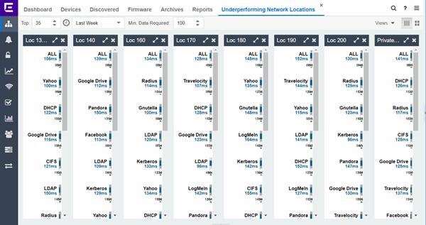
Use the menu at the top of the report to configure the information presented:
- Top:
- Choose the number of locations in networks with the slowest response times to display response times in the chart.
- Time Span
- Select the span of time for which network response times are displayed from the drop-down list. Available options are: Custom, Today, Yesterday, Last 30 Minutes, Last Hour, Last 2 Hours, Last 6 Hours, Last 12 Hours, Last 24 Hours, Last 3 Days, Last Week. The line graph displays detailed response time for each application over the length of time you define.
- Min Data Required
- Select the minimum number of response time data points required to display in the report.
- Display Format
- Select how data is displayed: Select (
 ) to display the data in columns or (
 ) to display the data in rows.
The report contains two types of graphs:
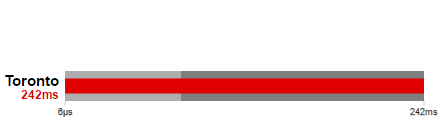
Expected Response Time
The Expected Response Time bar graph displays the range of network response times, the most recently measured network response time, and the expected network response time for an application a specific site (or all sites) during the date range you configure in the Time Span drop-down list. The value displayed on the far right of the graph is the slowest network response time observed during the selected time period. The vertical blue or red bar indicates the most recently observed network response time for the application.
| NOTE: | The values in this graph are an average of all response times observed every minute. |
|---|
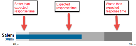
Hover over the Expected Response Time graph to display a pop-up with the most recent network response time for the site as well as the date and time the measurement occurred.
ExtremeCloud IQ Site Engine uses the standard deviation of the values gathered as network response times to determine the expected network response time for an application at a location. In the bar graph, the medium gray color indicates a network response time that falls within the "expected" range. This range is the average value of all observed network response times plus or minus two standard deviations, or about 95 percent of all response time values. A network response time in the light gray range is better than expected, while a network response time in the dark gray is worse than expected.
When a network response time is determined to be worse than expected, the location name and the network response time indicator turn red to flag the application.
Historical Response Time
The Historical Response Time line graph shows all of the network response times observed for the application at a location (or all locations).
| NOTE: | The values in this graph are an average of all response times observed every hour. |
|---|

Hovering over a point in the graph causes a dot on the line graph to appear, indicating the point in the network response time at which you are looking. Additionally, a pop-up with the date, time, and network response time appears for that point.
This is the data set from which ExtremeCloud IQ Site Engine creates the Expected Response Time graph. The wider the expected network response time range in the Expected Response Time graph (indicated by the medium gray color), the greater the variance in the values in this graph.
For information on related help topics: