Accessible from the Analytics tab in ExtremeCloud IQ Site Engine, the Insights Dashboard displays an overview of application usage on your network, as well as network activity statistics based on client/server, application, industry, and response time.
Use the Insights Dashboard to view graphs that display real-time network and application usage and service data, and tools that you can use to customize your dashboard using drag-and-drop capabilities.
Insights
The Insights Dashboard displays ring charts and a customizable Application Group Dashboard. You can collapse and expand the ring charts and Application Group Dashboard for flexible display capabilities.
Ring Chart
Six ring charts display real-time Engines, Virtual Sensors, Disk Usage, Flow Rate, Network, and Application usage and service data:
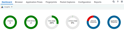
- Engines — The number at the center of the ring chart indicates how many engines are represented by the chart. The colors in the graph indicate the states of the configured engines. Hover over a ring color to display a tooltip with the status of that engine. Select the graph to display overview and status details.
- Virtual Sensors — The number at the center of the ring chart indicates how many virtual sensors are represented by the chart. The colors in the graph indicate the states of the configured virtual sensors. Hover over a ring color to display a tooltip with the status of that virtual sensor. Select the graph to display overview and status details. Select the graph to open the Virtual Sensors tab.
- Disk Usage — The number at the center of the ring chart indicates the percentage of Disk Usage. The colors in the graph display the percentage of disk usage being used. Hover over the ring color to display a tooltip with usage percentage and units of space details.
Select the graph to open the Configuration tab, where you can configure the information displayed in the Insights Dashboard.
- Flow Rate — The number at the center of the ring chart indicates the flow rate percentage. The colors in the graph indicate the flow rates for the different engines being used. Hover over a ring color to display a tooltip with status, percentage and rate details for each engine. Select the graph to open the Licenses tab.
- Network Response — The colors in the graph indicate the network response time for the application/site. Hover over a ring color to display a tooltip with status details and the number of networks at that status. Select a color in the graph to open the Network Service dashboard, which displays network service details.
- Application Response — The colors in the graph indicate the application response time for the application/site. Hover over a ring color to display a tooltip with response time details and the number of applications within the expected response time range. Select a color in the graph to open the Response Time dashboard, which displays network and application response time charts and details.
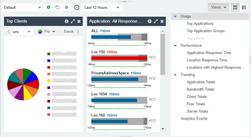
Custom Dashboard
The Custom Dashboard is a customizable space for viewing graphs that you select from the Views drop-down list. The buttons at the top right of the Applications Group dashboard ( ) enable you to save and copy your dashboard.
For information on related help topics: