The Tracked Application dashboard displays the performance (in response time) of your network for applications you configure in the Tracked Applications field on the Analytics > Configuration > Configuration tab.
To access the Tracked Application dashboard, open the Analytics > Dashboard tab and select Tracked Applications in the dashboard drop-down list.
Overview
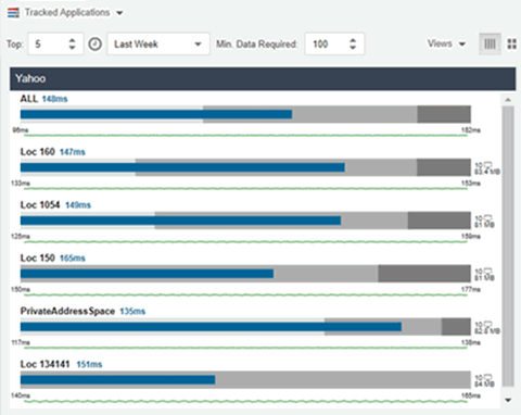
The Tracked Applications dashboard contains two graphs for each application, one displays the average response time over the selected time period and the other displays the individual response times over that period for each site. Data is updated every minute and can be manually refreshed by selecting the Refresh button ( ).
).
Select the number of sites displayed in each column in the Top field. The Tracked Applications dashboard can display up to 25 sites.
Use the Time Period drop-down list to display the date and time range for which data is displayed. Selecting Custom displays additional fields allowing you to indicate a Start Date and time and an End Date and time.
Use the Minimum Required Response Time Dashboard Data Points to configure the minimum amount of data ExtremeCloud IQ Site Engine requires before displaying a given application or site pair. The data below this threshold is not reliable and can set off a false alarm, however, you can adjust how much data is required based on the individual needs of your network.
Each column in the dashboard represents an application. The top row displays the average response time of all of the sites for that application, while the following rows indicate the top worst performing sites for that application.
You can display or hide any of the application columns using the Views drop-down list. You can also select the X at the top of a column to hide the column from the dashboard. Select the Single Row icon ( ) to display all columns in a single row, or select the Double Row icon (
 ) to display the columns in two rows.
Select the Maximize icon ( ) to expand a single application column.
The worst performing sites are defined as those whose response time is the slowest when compared to the expected response time observed over the selected time period. For example, a site with an average Microsoft Office 365 authentication response time of 40 ms over the past seven days that displayed a slowest response time of 50 ms would rank as a better performing site than a site with an average Microsoft Office 365 authentication response time of 5 ms over the same period that displayed a slowest response time of 30 ms.
Expected Response Time
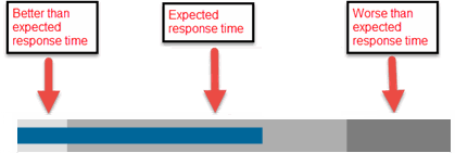
The Expected Response Time bar graph displays the range of response times, the most recently measured response time, and the expected response time for an application a specific site during the date range you configure in the Date Range drop-down list. The value displayed on the far right of the graph is the slowest response time observed during the selected time period. The vertical blue or red bar indicates the most recently observed response time for the application.
| NOTE: | The values in this graph are an average of all response times observed every minute. |
|---|
Hover over the Expected Response Time graph to display a pop-up with the most recent response time for the application as well as the date and time the measurement occurred. The Expected Response Time bar graphs also display the client count, represented by a number and a monitor icon ( ), and a client byte count observed as of the most recent measured minute. The client count is the number of clients using the service at the site. The client byte count indicates the amount of storage being utilized by clients. The data used for the client count, the client byte count, and the reported application response time are from the same recently observed minute.
| NOTE: | Client counts and client byte counts are not provided for the bar graphs that display the average application response time of all the sites for that service. |
ExtremeCloud IQ Site Engine uses the standard deviation of the values gathered as response times to determine the expected response time for an application at a site. In the bar graph, the medium gray color indicates a response time that falls within the "expected" range. This range is the average value of all observed response times plus or minus two standard deviations, or about 95 percent of all response time values. A response time in the light gray range is better than expected, while a response time in the dark gray is worse than expected.
When a response time is determined to be worse than expected, the site name and the response time indicator turn red to flag the application.

Selecting the Expected Response Time bar graph opens the Response Time dashboard filtered to display the application. If you select the application for a particular site, the Response Time dashboard also filters to that site.
Historical Response Time
The Historical Response Time line graph shows all of the response times observed for the application at a site.
| NOTE: | The values in this graph are an average of all response times observed every hour. |
|---|

Hovering over a point in the graph causes a dot on the line graph to appear, indicating the point in the response time at which you are looking. Additionally, a pop-up with the date, time, and response time displays for that point.
This is the data set from which ExtremeCloud IQ Site Engine creates the Expected Response Time graph. The wider the expected response time range in the Expected Response Time graph (indicated by the medium gray color), the greater the variance in the values in this graph.
For information on related help topics: